Blog 5: Jaime the Arrogant

I chose an image from the photo essay “Where Children Sleep” by James Mollison. The image I chose was the photo of Jaime, age 9, from New York. This particular image caught my eye in a way I did not expect. It seems that as I clicked my way through the images of “Where Children Sleep,” I expected to feel very sad when I looked at photos of poor children, and relieved when I saw images of kids who had a decent place to sleep. Unfortunately, when I looked at this picture, I felt the distinct feelings of judgment and frustration. Now, I do not think my reaction was a result of the boy’s apparent wealth; I believe it was a result of the framing in the image.

First, our eye is drawn to the all-white furniture against the horrifying pattern of the carpet. My eyes actually felt strained when I looked at that carpet. Then the lines of the photo point us towards the boy’s desk. On this desk, there are a number of very neatly placed objects. Above the desk, on two perfectly mounted shelves, were a globe, what seem to be miniature versions of tourist spots (the Eiffel Tower, the Empire State building, the statue of liberty), and a surprising number of trophies, as well as medals dangling from the bottom shelf. The busyness of the carpet, the wallpaper which mismatches with the uniform all-white furniture, and the child’s belongings all seem so out of place, so I might consider that as a hook for this photo (rather than the whole essay). While everything in the room seems to have a place, something seems off – possibly a result of the angle of the picture, since I always thought pictures of a bedroom tend to be taken from a front or side view of the bed (with the bed as the focus point in the room). Instead, we get the whole essence of Jaime’s room.

The story conveyed seems to be the story of a boy in New York, who is heavily involved in sports (signified by the trophies, as well as the golf clubs in the corner) and music (the cello). We can also see that this boy is wealthy enough to have a decent-sized room in New York – which is impressive in itself. However, I think my frustration came from the juxtaposition of the picture of Jaime with the contents of his room. It seems that Jaime must be wealthy – given his belongings, his awful carpet, and the suit that he is wearing (seriously, that kid is 9) – and yet his facial expression indicates that he could not care less. He looks bored and that struck me, as I looked at this image in contrast with the rest of the photo essay. It was hard to take in a boy with nice things, who had such an unconcerned look on his face, as I tried to understand the hardships of young children who slept on dirty tires, or on a barren hill. My sadness for the poor children was juxtaposed awkwardly with the image of Jaime, which resulted in my overall angry response to the photo. While I wish I could say this picture makes me happy because Jaime has a place to sleep, the elements that James Mollison used in this picture just force my opinion of Jaime as an arrogant little boy who should be more grateful for what he has, when some people do not even have a bed to sleep on. It’s fascinating how quick we are to judge the characters in the images set before us. It makes me wonder if our digital age is making us more or less prone to assuming things about people we do not know. Has an image become the new “first impression”?

Powerful Simplicity

The series of photos from the photo essay “Where Children Sleep” each have a picture of a child from a different country paired with a picture of their bedroom. The synopsis of the essay says that’s its goal was to promote children’s rights and show the complexity of the social issues facing children around the world. The genius in this series of photos is how powerful they are in their simplicity. The photojournalist says in his synopsis, “when Fabrica asked me to come up with an idea for engaging with child rights, I found myself thinking about my bedroom: how significant it was during my childhood, and how it reflected what I had and who I was.” These pictures use a child’s bedroom to tell about their lives and they lives of people where they live.

The picture that I am taking a closer look at is the image of the room Alyssa, 8, Kentucky, USA. In the image of her room the walls are falling apart. The wallpaper looks wet and moldy, and the section by the door is the barebones foundation of the house. The roof of the room is missing a panel with the instillation all gross and broken and hanging out the room. There appears to be very little space in the room, made apparent by the fact that her dresser and a file cabinet are shoved up against the door leaving very little space to get in and out from. There are a number of toys and trinkets in the picture but all of them have a decent level of wear and tare to them.

I found the photo to be especially shocking, especially when you take into account the picture of Jazzy, 4, Kentucky USA. Both girls are white females from the same state but their situations appear to be drastically different judging by the state of their rooms. Jazzy’s room is large and extravagant and everything is pink and bright compared to Alyssa’s brown, small room. Jazzy’s room show her bed and her floor is littered with crowns from pageants and her furniture is covered in ribbons. The story the image tells is one of a girl who is living in poverty but still finds importance in decorating her room to make it hers.

The differences from room to room for the children in the journal are rhetorically powerful statements because it is hard to imagine that there are children actually living in such terrible conditions. This causes the audience to feel a stronger emotional response to the situation then any statistics or written information may have

The Beauty of Abandonment

It’s almost hard to for me to choose just one picture from Yves’ collection, “The Ruins of Detriot”. To be cliché, there is something so eerily beautiful about the abandonment of this once thriving city. As beautiful as all of the photographs are, I chose the one that I actually said, ‘Wow”.

Even though there’s no center focus, it’s still so captivating. The eyes are drawn to many points of the photograph. The ceiling, the giant hole to the left, the stage, the seats. The eyes will look everywhere. There’s also much detail in this photograph even though it is a long shot. The detail and craftsmanship of the building is evident. The designs engraved into white material that surrounds the theatre is astounding and I would really like to see a close up of this. But this photo also has depth because the viewer is truly able to see the three dimensions, especially with the light and shadows, which adds contrasting elements to the photo. I believe the viewpoint also plays a role in this photograph. It’s not head on just looking at the stage or looking out from the stage to the audience. The angle actually makes me feel like the view is neither from the audience or the stage, but on the sidelines, like an usher or someone. This photo in the collection adds to array of disarray and chaos, which ranged from a small scale from the melted clock (also really cool) to the Michigan Central Station with all its windows blown out (also a super cool photo). I’ll just add them in here…

This is a story of the old. This is a story of being forgotten. This theater is where Henry Ford and his wife would come to watch the best actors in the city put on “Macbeth” or “King Lear”. This is a story of two world wars and a great depression. This is a story of technology. As technology advanced, people neglected the fine art of playwriting and presently acting and moved on to screenwriting and watching prerecorded films. The stage had been replaced with a screen. As times progressed, the theatre stood still in time. Detroit’s condition plummeted and the thriving city began to decay.

For me, there is something so wonderful and satisfying in seeing something or being somewhere that has been abandoned for so long. I have no idea why, but here’s how best to explain it: There’s this line in episode of a Doctor Who episode called “Blink” (it’s amazing episode and everybody should watch it! Sorry my Whovian came out), one of the characters says, “I love old things. They make me sad… Sad is happy for deep people”. I’m not saying I’m not super deep or anything, but it’s the best way to express how I feel about this collection.

Risa and Me

Risa, 15, Kyoto, Japan

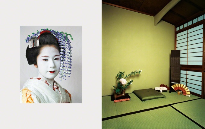
James Mollison’s Risa, 15, Kyoto, Japan exemplifies the rule of thirds, especially the photograph of Risa’s room. On the x-axis, the screen wall takes up the right third of the composition. On the y-axis, the point where the floor and two walls meet (behind the fan) demarcates the line between the bottom and central thirds. This line is the photograph’s busiest portion; it contains all of Kyoto’s possessions. The floor and two walls balance each other in how busy they are: the left wall has no lines, the floor has sparse lines, and right wall has many lines. Not to mention, there are three mats on the floor and three window portions on the screen wall. Every section of the photograph uses the rule of thirds to form a balanced, orderly composition.

Mollison placed this diptych at the very end of his series. Like the last sentence of a book, the last picture in a photo essay is emphasized because it completes the work. Risa is a good ending to the essay for three reasons:

1) It showcases Mollison’s photographic skills. Using the rule of thirds, the composition of Risa’s room is perfectly balanced yet compelling. Every aspect of the two photographs (composition, lighting, cropping, etc.) feels intentional. Risa accomplishes this task better than the photographs that precede it.

2) It gives a (presumably) Western audience a peek into a culture distinctly different from our own. Few Americans – or anyone, for that matter – get to see a girl dressed up like a geisha or her bedroom in the Japanese architectural style. Of course, anyone can Google these images, but they feel special when isolated and placed side-by-side. By seeing both Risa and her bedroom, I understand the subculture that she inhabits better than I did before.

3) The diptych is just nice to look at. The flowers in Risa’s hair mimic the flowers next to her pillow. Her blood-red lipstick and pink eyeliner pop next to her white foundation. In her bedroom, chartreuse paint and decorations make the dark wood look sumptuous. Mollison excellently applied all of the principles of design – emphasis, proportion, rhythm, variety, and unity.

Like Ira Glass said, the best storytelling makes the audience think, “Now I understand what it would be like to be that person.” Risa’s photographs tell me plenty about her life. Even without knowing much about her hometown of Kyoto, I can tell that she is wealthy, cares about what other people think of her, favors minimal design, enjoys cleanliness, and delights in nature. When I saw her portrait, I was reminded of facts that I learned about the beauty regimen of geishas. Traditionally, their white foundation is made from bird droppings. The ideal lips are painted with red lipstick to look as thin as possible. No makeup covers the back of their necks to draw attention to the neck, a body part that is considered sensual. Risa both affirmed and added to my understanding of geishas. But more than that, Mollison gave me a glimpse into Risa’s life. At first glance, I thought that Risa’s life was different from mine in nearly every way. But after studying the diptych, we have more in common than I thought.

Empty People, Empty Places

The most striking image to me while going through all the photograph stories comes from “The Ruins of Detroit” and is the photograph “Bagley-Clifford Office of the National Bank of Detroit”. First of all, it fits in with the larger scheme of the story because it’s all about the destruction of Detroit and how it’s gone down the drain from the motor giant it once was. Not only that but I feel this picture is one of the most raw forms of showing how bankrupt the city is because it’s the National Bank of Detroit and it is torn apart and empty. No people, no jobs, and definitely no money left. The bank is stripped much like the city and the people are, not even the metal of the vault door is left there still. It is easy to inference that people went in and searched the area, took anything of value from the bank. It is very much a political statement as well. You can feel the desperation of the people, of the city, even for the bank and the cold lighting gives it an old and distant feel, especially when this wood looks like in its heydays it would be a rich, warm hue.

What originally caught my attention with this piece though is the leading lines within it. First there is the straight parallel lines of perspective that come from the wall of shelves which draws your eyes in. And then the drawers pulled out bring your eyes out towards the middle of the piece and leads the gaze onto the drawers that litter the floor, all straight lines and angles. The wall of emptied drawers also holds the element of pattern that draws the eyes to it.

Another unqiue part of it is the viewpoint of a three-quarter view of the wall instead of just looking at it straight on or giving it a slimmer angle to focus on the rest of the room. This speaks for the entirety of the room and also keeps the balance by giving the more simplified bank vault door so that there isn’t an overwhelming amount of information to take on with both sides of the photo being busy. Instead it is balanced with simple and busy.

Is there a different story that you get from this picture? If you saw this photo alone without the connection to the Ruins of Detroit, what would you believe had happened? How does the story change? Are there any other elements that work for you in this image?

The Endless Garage

This photo from “The Ruins of Detroit” really stuck with me. It’s a long shot of the dilapidated, abandoned remains of the Fisher Body car dealership (now a small part of General Motors). The first thing I noticed was the color in relation to the photos around it. Most of the other pictures in this photo essay were grey shades and splashes of color, fading or muted with the passage of time.  This photo immediately stands out from those with its almost turquoise hue permeating the entire photo.

Through the whole space, bricks and detritus have crumbled to the ground in misshapen hills and piles, and exposed pipes and wires hang from the ceiling. The garage seems to stretch on for miles in the left foreground even though we can clearly see the window at the far end. This impressive use of perspective is done in such a way that our eyes are immediately drawn from the pile of bricks and rubble on the ground to the small light down that long passage, as if giving us a literal light at the end of the tunnel, a glimmer of hope for the future of the city.

I’ve always loved photos or videos taken from abandoned buildings, and to see one in such a state of decay and ruin is not only enlightening, but humbling. Who knows where Pittsburgh will be in ten or twenty years? Could it look anything like Detroit looks now? I hope not, but you never know. This photo tells a very powerful story considering that at one point Fisher was an extremely popular car, and now since the company went belly-up, hundreds of people went home jobless and the metal of millions of cars went to the scrap heap. This photo is the story of a ghost town that used to be one of the most burgeoning places in the country.

Mr. Kramer

Screen Shot 2014-09-24 at 2.22.01 PM

While I was flipping through the photo essay, “Remembering Hardware,” the second photograph really caught my attention. The photo captures Mr. Kramer, the main subject of the essay, in a close-up shot. The photo is a portrait shot of Mr. Kramer, and like all good portrait shots, the picture made me feel a personal and emotional connection to the man. I immediately got the sense that Mr. Kramer enjoys his job and I trust that he can remember every piece of hardware in the store. The image itself shows Mr. Kramer’s daily actions, but as I read the photographer’s descriptions of how important Mr. Kramer is to the hardware store, I felt a sense of admiration for him. There is something fantastic and slightly sad about Mr. Kramer. I can’t quite decide what exactly it is, but I know this picture made me feel slightly ambivalent about my own emotions. This is a man who loves the routine of his everyday life and does his simple job extremely well. For some reason, the emotion’s on Mr. Kramer’s face pull on my heart a little bit. Clearly, the photographer did a good job of manipulating my emotions and grabbing my attention.

Beyond the emotional aspect, this photo has many compositional elements that make it great. Although the photo is very close to Mr. Kramer’s face, it still follows the rule of third. His body is positioned more to the right of the frame and he is holding the phone up on the right side. Mr. Kramer does take up a majority of the frame, but all of the action takes place on the right side of the picture. This photo also makes a good use of balance and background. The background is heavily blurred out so that the eye focuses solely on Mr. Kramer, but there are still vague objects in the background that balance out the left side of the photo. The viewpoint of this photo is also great because the photographer shot the photo slightly from the side and up-close. I like the slight side angle of Mr. Kramer – it makes it seem as though we are seeing him in a very natural environment. I feel like this is just a snapshot of him having an uninterrupted conversation with a customer. Finally, this photo makes a good use of cropping. I’m not sure if this photo was originally taken at this distance or it the photographer later cropped it to show the subject’s face, but this photo makes good use of cropping either way. The photo is cropped so that Mr. Kramer’s face is easily the main focus of the picture, allowing us to analyze the details and emotions on his face.

This photo plays a large role in the photo essay. The closeness and sole focus on the subject allows the viewer to connect with the emotional side of Mr. Kramer’s story. The close-up shot literally made me feel physically closer to Mr. Kramer. I felt as though I understood his emotions by seeing the specific lines on his face and look in his eyes. Overall, this picture does a great job of showing a simple man who loves his job. I think this plays in very well with the overall story of Mr. Kramer – to me, his life is both happy and sad. But maybe that is just because I have a soft spot for older people. I sometimes find it difficult to describe the reasons why photographs evoke certain emotions – this photograph is no exception. Did this photograph make you feel a certain way when you first saw it? Or did you ever encounter a photograph that made you feel a way you weren’t able to describe?

Lost in the Chaos

The picture “Highland Park Police Station” from the photo essay “The Ruins of Detroit” particularly peaked my interest whenever I went through the projects. It shows a disheveled, abandoned police station with many papers and photos left behind. I think the photograph’s depth serves as the main compositional element. Up close, you see many pictures (possibly suspects or victims), fingerprint documents, and “reward” signs. You can pick up on many small details. In the middle ground, you see several desks with open drawers and scattered documents. In the background, you can see two blue doors and more papers on the ground. The depth of this picture makes it more interesting than if you could only see the papers up close or the scattered desks. Instead, you get this whole chaotic image at once, which seems to work for the shot. Although the picture seems cluttered, I think the photographer followed the rule of thirds by off-centering the beaten up white door to the left. With so much going on, it acts as a nice focal point for the picture. Lastly, leading lines from tiles on the walls take the viewers eyes from the close up pictures and papers all the way to the back of the room. It seems to pull the viewer further into the picture. All of these compositional techniques make for an interesting photo.

This picture fits well with the other pictures of “The Ruins of Detroit.” The photographer shows many different kinds of abandoned buildings and facilities: banquet halls, hotels, schools, libraries, office buildings, and a post office. The abandoned police station relates to the other images to create an overall story about Detroit as a deteriorating city.

This photo evokes a sense of curiosity and empathy within the viewer. A police station is supposed to be an organized, populated safe haven of the community. Instead, we see a ransacked, desolate station. As a viewer, I felt intrigued and saddened by the emptiness. I don’t know why, but I almost felt like this picture captured a sense of tragedy that I cannot exactly put my finger on.

Overall, this image conveys a story of loss. A police station that was once a vital part of the community is now gone, along with schools, theaters, and other public places within Detroit. This photo tells a story of the history of Detroit: what used to be and what is now. This picture of the Highland Park Police Station raises many questions for me. Why was it abandoned? Did it move to another location? Why did they leave behind these records and photographs? What happened to Detroit to allow this much abandonment within the city? Specifically, I can’t help but wonder what happened in this station to get to where it was in this photograph.

27

Painfully Simple

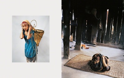
All three photo essays were quite eye-opening but the one that I could not stop thinking about once I went through the images was “Where Children Sleep, particularly the image displaying where a 14 year old girl, Jyoti, sleeps in Makwanpur, Nepal. Most of the photographs displayed in the photo essay were very filled (for lack of a better word). The images depicting the extravagant and even what we may consider “average” or “normal” bedrooms were quite filled with typical items you would find in a child’s room; even the images of the horrifying and dilapidated, not rooms, but sections of land in which children must sleep were either filled with dirty mattresses or random, run-down objects. Yet in this photograph of where Jyoti sleeps the location is so bare, so painfully simple.

It fits in well with the other images for it easily contrasts with the more extravagant rooms shown, bringing about the realization of what little so many children around the world actually have. However, this image evokes a shocking amount of sympathy and compassion for this young girl compared to the other images of the worse-than-poor living conditions children must grow up in. There are no random, dirt-covered objects scattered about the area, there are no mattresses covered in old sheets and dust, there is just one straw rug and one blanket.

Those two objects, lit up from the large cracks in the “house” structure, physically show just how little this young girl as well as so many other children have; there are no personal items, no toys, only less than the bare minimum. It almost makes one feel the loneliness she must feel. Just this one image makes me think how frequently she must have to move around and find new places to sleep in, how instead of getting up, getting fed from her parents and going to school as children should be able to do, she must instead find what she needs to survive, every single day. Overall, it makes you feel her exhaustion and her strength.

blog post 5

The Endless Stare

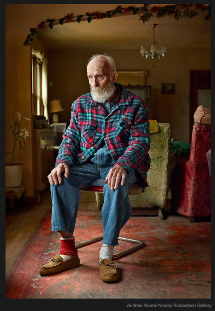
The one image that stood out for me was the photo of Lynn Lincoln Bauer in the photo story, This is What it Looks Like at the Center of America. The photo compositionally is a medium shot, in that it shows this 92 year old man in his environment. I believe this pushes the theme of isolation more so than any other picture. Seeing that man in his house, which is clearly very old and outdated, is a shock to the viewer. Imagining being alive that long without ever experiencing modern amenities is almost too hard to comprehend. All of these feelings were captured with that simple medium shot because it encompasses so much for being so simple.

The whole theme of, This is What it Looks Like at the Center of America, is one of isolation, death and serene beauty, in which this picture contains all three of these themes. Obviously the picture conveys isolation, because he is sitting in what appears to be a very old house and that is beard is long and gray. The blank stare on his face shows a man who is facing death. It provokes the viewer to wonder what he is thinking about as he stares. I believe he is thinking about his life and all the hard work he has accomplished living in such a rural area. Lastly there is some beauty to this picture. It’s amazing to think about this man and realize he’s lived his entire life not having experienced the modern things we take for granted everyday. A beautiful thought that makes one happy to have all the things we have in this modern world.

This picture shows that the old saying, “A picture is worth a thousand words”, is true. The photographer who took this picture was trying from a rhetorical standpoint, to convince the reader of the isolation and beauty of Middle America. They clearly accomplished this task using the techniques and compositional effects that I mentioned before. It’s such a strong picture and argument, that even after viewing it one can’t forgot about it all day. One just stares and wonders.

Untitled